My Role
As the UX Designer, I was responsible for defining the structure, flow, and visual hierarchy of the Ring Portal Dashboard. My focus was on translating complex system data into a user-friendly experience that allowed users to quickly access key metrics and insights without cognitive overload.
Tools: Sketch, Illustrator
The Challenge
The main challenge was to organize a high volume of real-time device and performance data into a layout that felt intuitive, consistent, and actionable. Agents needed to monitor multiple devices and interpret technical metrics at a glance—without losing context or clarity.
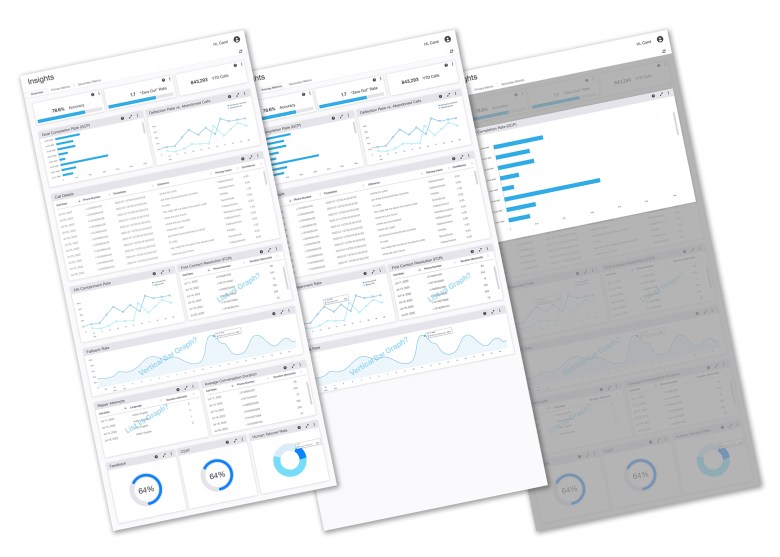
The Solution
I designed a modular dashboard system with clearly defined sections, prioritizing key performance metrics through summary cards and interactive graphs. By establishing a clear visual hierarchy, optimizing data visualization, and maintaining Ring’s clean, accessible design language, the dashboard transformed complex analytics into clear, meaningful insights that empowered agents to act with confidence.
